Mobile phones are now the most common way to access the internet.
This trend spells doom for old, aging websites, whose layouts were never meant to be absorbed by the sensitive immune system of a smartphone. Google now ranks websites not friendly to mobile phones lower. This "mobile-first" indexing means Google primarily uses the mobile version of the webpage for ranking and indexing purposes. Mobile user friendliness has now become survival of the fittest, and websites that don’t adapt will go extinct.
Your content could change someone’s life, yet it could also be lost to a large audience not patient enough to look up your site on their computer. So what can be done to salvage your site’s reach?
Your website needs to run on every device
From tablet to phone and from vertical display to horizontal display, your website has to take every swipe, tap, and poke that visitors dish out, and has to adjust to any screen size.
So let us lend you a hand.

Call 561.799.4800
All our websites include the following features:
- Modern WordPress design
- Contact form
- Google map showing your business location
- Social Media links
- Mobile-responsive layout
(look good on smartphones and tablets) - Homepage slideshow (if desired)
- Up-to-date plugins
- Coming Soon page (if necessary)
- Submit sitemap to google
- And more!!
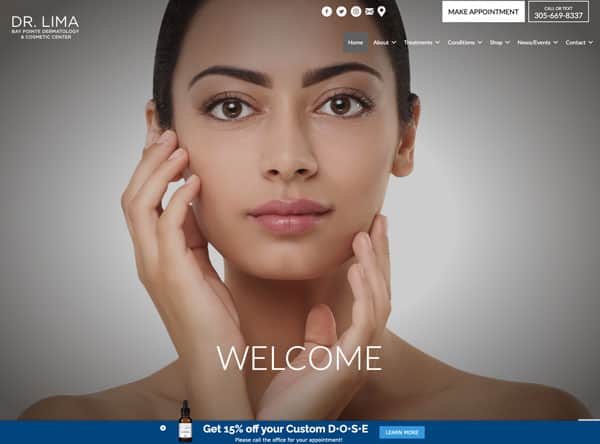
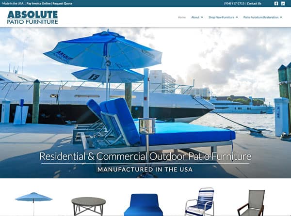
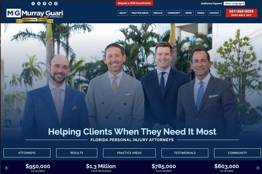
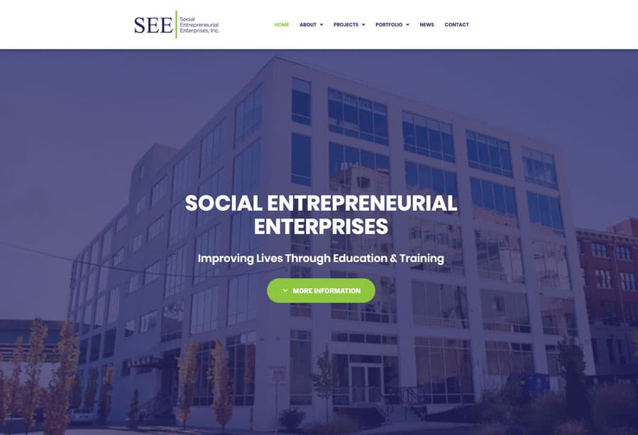
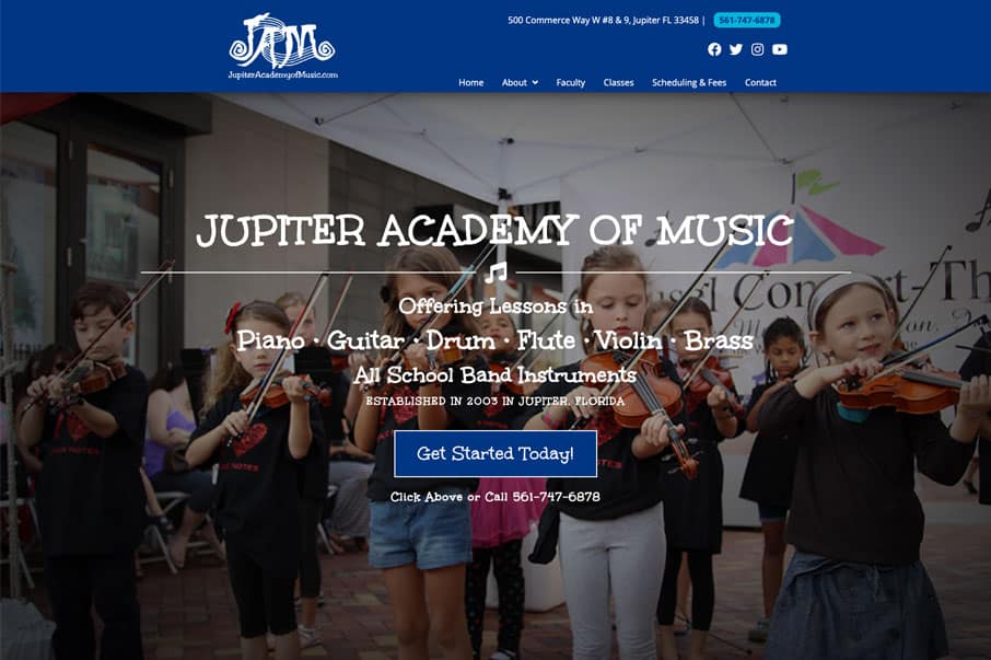
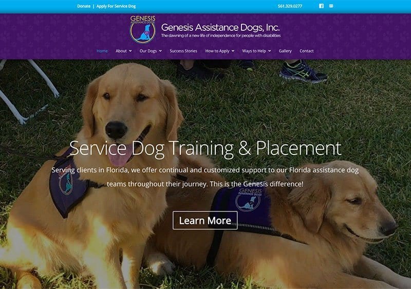
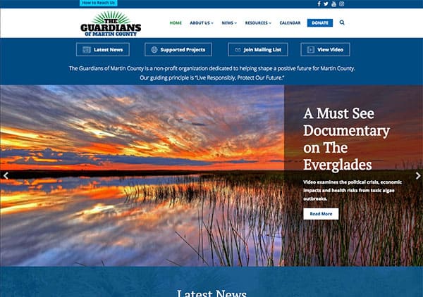
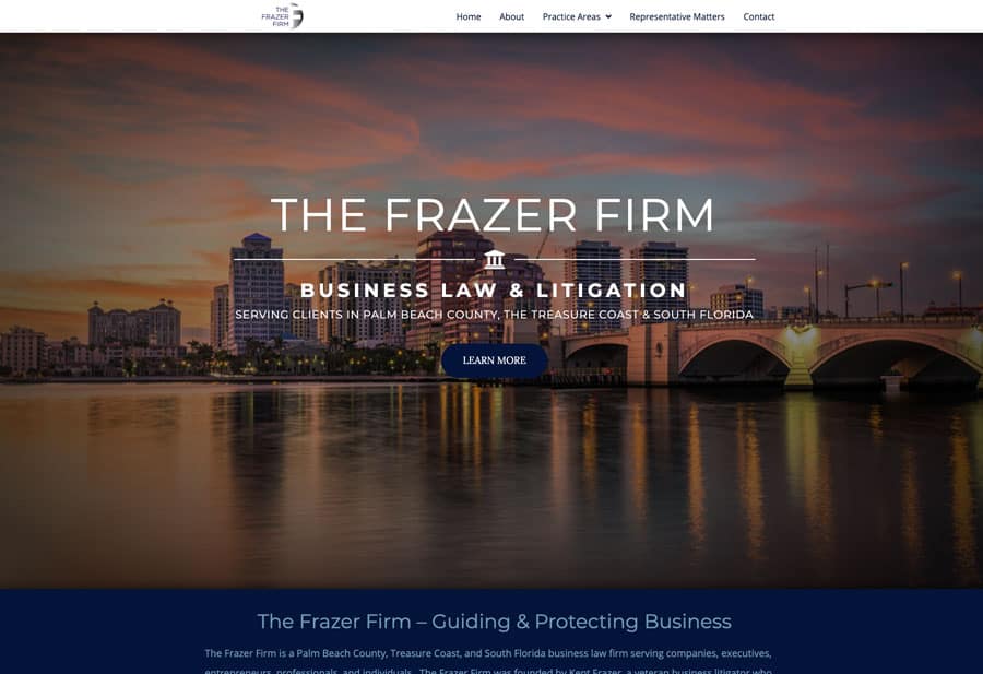
Some of Our Past Work


Testimonials
By far, Granat Design is one of the best website design companies in Florida. They are top at their game and care about their client. Hire them!
Pauline Mayer
PTM Marketing
As someone who works in the digital marketing space as well, I know that it's (sadly) rare to find people of high quality character to help you with your website, marketing and design needs. Matt is a true pro. His work is top quality and he does everything for a fair price.
Ricky Shockley III
Shockley Marketing